Introduction
The Congestion Count Indicator helps identify areas of congestion in a trading chart, which are periods of tight trading ranges usually associated with low trade volume. This indicator is particularly useful in markets that are consolidating in close overlapping price ranges.
Origins
The Congestion Count Indicator is a proprietary study developed by CQG, a leading provider of high-performance trading, market data, and technical analysis tools. It is designed to alert traders of long periods of congestion with the possibility of a price “break-out” away from congestion. In this article we show you how to make your own version.
Mathematical Construction
The Indicator operates by two methods – Last or Group. “Last” refers to the last bar sharing price range values with previous bars and “Group” refers to every bar in the group sharing price range values. When the price range values are no longer shared with previous bars or grouped bars, the counter is reset to one. The counter will then increment when sharing takes place.
Purpose and Design
The primary purpose of this indicator is to identify areas of congestion or consolidation in the market. These are periods where the price is moving within a tight range, often associated with low trading volume. The indicator alerts traders to these periods of congestion, signalling the potential for a price “break-out” away from the congestion. This can be a valuable signal for traders looking for opportunities to enter or exit trades.
Interpreting Signals
The Congestion Count Indicator provides a numerical value that represents the number of bars sharing price range values. This count resets to one when the price range values are no longer shared with previous bars or grouped bars, and increments when sharing takes place.
When the count is high, it indicates a prolonged period of congestion or consolidation, suggesting that the market is in a state of equilibrium with no clear trend. This can be a signal to traders to watch for a potential “break-out” from the congestion. A break-out occurs when the price moves outside the range of the congestion, potentially starting a new trend.
Pros and Cons
Like any trading indicator, the this indicator has its strengths and weaknesses.
Pros
- Identifies periods of congestion: The main advantage of the Indicator is its ability to identify periods of congestion or consolidation in the market. These periods can often precede significant price movements, so identifying them can provide valuable trading opportunities.
- Flexible: The indicator offers two methods – Last or Group – allowing traders to choose the one that best fits their trading strategy.
- Works in any market: The indicator can be used in any market that experiences periods of consolidation, making it a versatile tool for traders.
Cons
- Dependent on the lookback period: The effectiveness of the indicator can be heavily influenced by the lookback period chosen by the trader. A lookback period that is too short may result in false signals, while a lookback period that is too long may result in missed opportunities.
- No indication of break-out direction: While the indicator can signal a potential break-out from congestion, it does not provide any indication of the direction of the break-out. Traders will need to use other analysis tools or techniques to predict the direction of the break-out. Have a look at using MLRR2 with it.
Practical Tips for Using the Indicator in Trading
When using the indicator, there are several best practices to keep in mind:
- Combine with other indicators: As it does not provide any indication of the direction of a potential break-out, it is best used in combination with other technical analysis tools that can provide this information, such as trend indicators or momentum oscillators.
- Adjust the lookback period: The lookback period should be adjusted based on the trading timeframe and the volatility of the market. A longer lookback period may be appropriate in a more volatile market, while a shorter lookback period may be suitable in a less volatile market.
- Use in sideways markets: The indicator is particularly useful in sideways markets, where the price is moving within a narrow range. In these markets, the indicator can help identify periods of congestion and potential break-outs.
- Watch for breakouts: The Congestion Count Indicator can also be useful for identifying potential breakouts from congestion. Keep a close eye on these situations, as they can provide excellent trading opportunities.
Building Your Own Congestion Count Indicator in Python
Python is a versatile language widely used in the field of trading and finance for its simplicity and the extensive libraries it offers. In this section, we will guide you on how to build your own version of the Congestion Count Indicator using Python. Even if you’re a novice, don’t worry! We’ll break down the code into manageable sections and explain each part.
You can use a free programme like VSCode, install Python then install the required modules by typing in the Terminal:
pip install pandas matplotlib mplfinance yfinance
Note that matplotlib.patches and matplotlib.dates are submodules of matplotlib, so you don’t need to install them separately. Once you’ve installed matplotlib, you can import these submodules directly in your Python script.
Importing Necessary Libraries
The first step in any Python script is to import the necessary libraries. In our case, we need pandas for data manipulation, matplotlib and mplfinance for data visualization, yfinance to fetch data, and a few others for specific tasks. Create a new .py file in VSCode and begin adding the blocks of code below into it in the same order as I put them in this post.
import pandas as pd
import matplotlib.pyplot as plt
import mplfinance as mpf
import yfinance as yf
import matplotlib.patches as patches
import matplotlib.dates as mdates
Fetching and Preparing Data
Next, we define the ticker symbol for the stock we’re interested in (in this case, ‘TSLA’ for Tesla) and use the yfinance library to fetch the historical price data for this stock. We also ensure that the data is sorted by date.
# Define the ticker symbol
tickerSymbol = 'TSLA'

# Get data on this ticker
tickerData = yf.Ticker(tickerSymbol)

# Get the historical prices for this ticker
df = tickerData.history(period='1d', start='2022-01-01', end='2023-05-31')

# Ensure that data is sorted by date
df = df.sort_values('Date')
Defining the Congestion Count Function
Now we define a function to calculate the count. This function takes a DataFrame and a lookback period as inputs, and returns a list representing the count for each bar.
# Define Congestion Count (CC) pattern
def congestion_count(df, lookback):
    cc = [0] * len(df)
    for i in range(lookback, len(df)):
        min_val = df['Low'].iloc[i-lookback:i].min()
        max_val = df['High'].iloc[i-lookback:i].max()
        if min_val <= df['Low'].iloc[i] <= max_val and min_val <= df['High'].iloc[i] <= max_val:
            cc[i] = cc[i-1] + 1
        else:
            cc[i] = 0
    return cc
Applying the Congestion Count Function
Once we have defined our Congestion Count function, we can apply it to our DataFrame. We define a lookback period (in this case, 7 days) and add a new column to our DataFrame that represents the Congestion Count for each bar.
# Add the pattern column to the DataFrame
lookback = 7  # Define the lookback period
df['Congestion Count'] = congestion_count(df, lookback)
Preparing for Visualization
Before we can visualize our data, we need to do some preparation. We define a color for our count pattern and create a new figure and axes for our plot.
# Define color for the pattern
colors = {'CC': 'black'}

# Create a new figure and axes
fig, axes = mpf.plot(df, type='candle', style=style, title='Candlestick Chart - TSLA', ylabel='Price', returnfig=True)

# Get the main Axes object
ax = axes[0]
Visualizing the Congestion Count
Now we’re ready to visualize our data. We iterate over our DataFrame, and for each bar where the Congestion Count is greater than 0, we add a rectangle to our plot. We also add a count label to the plot for each new bar of congestion.
# Iterate over the DataFrame rows
for i in range(len(df)):
    # If the pattern is found in the current row
    if df['Congestion Count'].iloc[i] > 0:
        # Calculate the rectangle parameters
        x = df.index.get_loc(df.index[i])
        y1 = df['Low'].iloc[i]
        y2 = df['High'].iloc[i]
        width = 1

        # Create the rectangle
        ax.fill_between([x-0.5, x+width-0.5], y1, y2, color=colors['CC'], alpha=0.3)

        # Add the count label to the plot
        if df['Congestion Count'].iloc[i] > df['Congestion Count'].iloc[i-1]:
            ax.text(x, df['Low'][x], df['Congestion Count'].iloc[i], color='blue', fontsize=9, ha='center', va='top')
Adding Breakout Arrows to the Plot
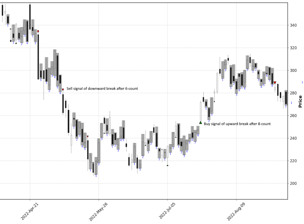
The next step is to add arrows to our plot to represent breakouts from congestion. We continue iterating over our DataFrame, and for each bar where the Congestion Count is 0 but was greater than 0 in the previous bar, we add an arrow to our plot. The direction and color of the arrow depend on whether the closing price of the current bar is above or below the range of the congestion. We also adjust the size of the arrow marker depending on how long the congestion has lasted for, implying perhaps a better buy or sell breakout after an extended period of congestion.
# If the pattern is not found in the current row but was found in the previous row
if i > 0 and df['Congestion Count'].iloc[i] == 0 and df['Congestion Count'].iloc[i-1] > 0:

    # Calculate the arrow parameters
    x = df.index.get_loc(df.index[i])
    congestion_min = df['Low'].iloc[i-1 - df['Congestion Count'].iloc[i-1] : i-1].min()
    congestion_max = df['High'].iloc[i-1 - df['Congestion Count'].iloc[i-1] : i-1].max()
    if df['Close'].iloc[i] > congestion_max:  # Green upward arrow
        y = df['Low'].iloc[i]
        dy = -0.05 * (df['High'].iloc[i] - df['Low'].iloc[i])  # Change direction
        color = 'green'
    elif df['Close'].iloc[i] < congestion_min:  # Red downward arrow
        y = df['High'].iloc[i]
        dy = 0.05 * (df['High'].iloc[i] - df['Low'].iloc[i])  # Change direction
        color = 'red'
    else:  # No breakout
        continue

    # Adjust the size of the arrow based on the congestion count
    arrow_size = df['Congestion Count'].iloc[i-1] / 10  # Adjust the denominator to control the size

    # Create the arrow
    ax.annotate('', xy=(x, y), xytext=(x, y + dy),
                arrowprops=dict(facecolor=color, shrink=0.05, headlength=10*arrow_size, headwidth=10*arrow_size))
In this code, the color of the arrow is determined by comparing the close of the breakout candle with the high and low of the congestion zone. If the close is higher than the high of the congestion zone, the arrow is colored green. If the close is lower than the low of the congestion zone, the arrow is colored red. If the close is within the congestion zone, no arrow is drawn.
Displaying the Plot
Finally, we display our plot with the plt.show() function.
# Display the plot
plt.show()
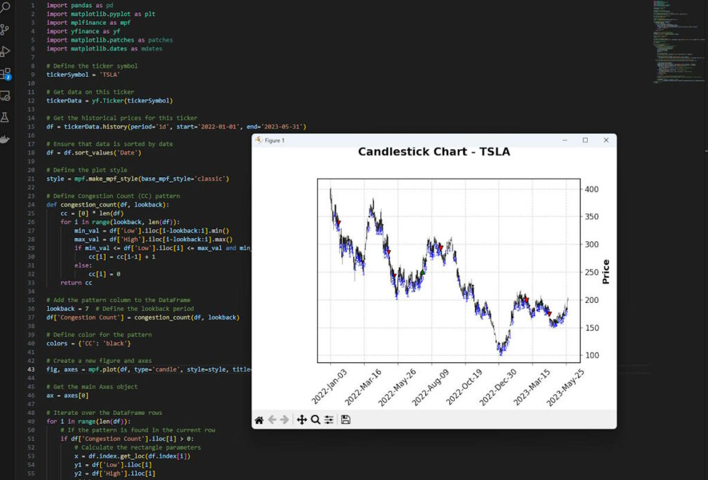
As I mentioned at the start, once you put all this code together, save it as a .py file type and run it in a free programme such as Microsoft VSCode by clicking the play button in the top right of the workspace, you should see the chart with your custom indicator generated like this:
If you zoom in you can get the idea of how this is now working, larger red markers indicate a sell off breakout from longer congestion periods and green arrow markers show the opposite:
You could then develop this idea into a screener for real-time data, because although these breaks may appear obvious when looking at the open chart, it might be much more useful to be alerted to securities where this is occurring that you wouldn’t necessarily have up on your screens all the time. Consider how you could build, back test and improve on this idea for your own needs. This is a stepping stone which hopefully brings some inspiration to the possibilities out there.
For those that are interested, in addition to this post we put together another look at adding Moving Linear Regression R squared (MLR22) to the above congestion chart to give us some more confidence in whether the break will likely run or not, so check that out too.
Conclusion
The Congestion Count Indicator is a unique tool that can help traders identify periods of congestion and potential breakouts. By understanding its origins, mathematical construction, and purpose, and by learning how to code something similar in Python, traders can add this powerful tool to their strategy. As always, remember to combine any indicator with other analysis tools and to adjust its parameters to fit your specific trading strategy.
References and Further Reading
For more information on the Congestion Count Indicator and technical analysis in general, consider the following resources:



Leave a Reply