
What is the MLRR2?
The Moving Linear Regression R Squared (MLRR2) is a technical analysis tool that plots the square of the correlation coefficient based on the Moving Linear Regression (MLR) for a chart being shown. This measure provides a degree to which two variables are linearly related, with the study computing between 1 and zero. A value of 1 signifies an absolute correlation within the trend, while a zero indicates either no trend or a reverse correlation, such as a sharp change in trend.
The MLRR2 can be particularly useful in trading when used in conjunction with the Congestion Count Indicator. The majority of this post focusses on implementing these two indicators into a chart created with Python and identifying the resulting trade signals. Don’t worry if you’re a beginner at this as I’ve provided you with a step by step guide of how to do it a little further down.
Creating MLRR2 with Python
Refer back to our post on the Congestion Count indicator, then suppose we want to add the MLRR2 to that Python plot of Tesla we made. We would need to define a function to calculate the MLRR2, similar to how we defined a function to calculate the Congestion Count. This function would take a DataFrame and a lookback period as inputs, and return a list representing the MLRR2 for each bar. We would then add a new column to our DataFrame that represents the MLRR2 for each bar, and modify our visualization code to plot the MLRR2 along with the Congestion Count.
We first need to define a function to calculate the MLRR2. We can use the numpy library’s polyfit function to perform the linear regression, and then calculate the R-squared value from the regression’s residuals.
Here’s how we do it (there is a more detailed guide further down if you’re new to running Python):
I assume you have the numpy and mplfinance libraries installed. If you don’t, you can install them using pip:
pip install numpy mplfinanceIn the following function, I’ve used np.polyfit to get the slope and intercept of the linear regression, then used those to calculate the predicted y-values (y_pred). Then I’ve used np.corrcoef to calculate the correlation coefficient between the actual and predicted y-values, and squared that to get the r-squared value.
import numpy as np

def calculate_mlrr2(df, lookback, price='Close'):
    y = df[price].values
    x = np.arange(len(y))
    mlrr2 = [0] * len(df)
    for i in range(lookback, len(df)):
        slope, intercept = np.polyfit(x[i-lookback:i], y[i-lookback:i], 1)
        y_pred = intercept + slope * x[i-lookback:i]
        r_value = np.corrcoef(y[i-lookback:i], y_pred)[0, 1]
        mlrr2[i] = r_value**2
    return mlrr2

# Add the MLRR2 column to the DataFrame
df['MLRR2'] = calculate_mlrr2(df, lookback)
Now, we can add a subplot to our plot to display the Congestion Count and MLRR2 as lines. We can use the mpf.make_addplot function to create the additional plots, and then pass them to the mpf.plot function using the addplot parameter.
# Create the additional plots
ap1 = mpf.make_addplot(df['Congestion Count'], panel=1, color='b', secondary_y=False)
ap2 = mpf.make_addplot(df['MLRR2'], panel=1, color='r', secondary_y=True)

# Create a new figure and axes
fig, axes = mpf.plot(df, type='candle', style=style, title='Candlestick Chart - TSLA', ylabel='Price', addplot=[ap1, ap2], returnfig=True)
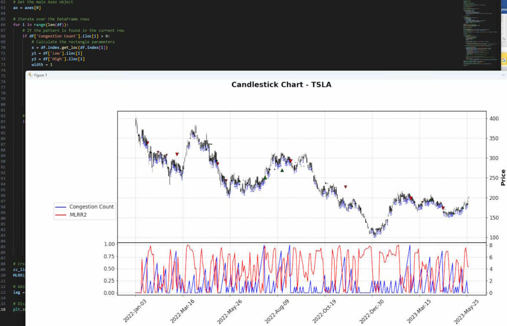
This will create a subplot below the main plot, with the Congestion Count displayed as a blue line and the MLRR2 displayed as a red line. The secondary_y=True parameter for the MLRR2 plot means that it will be plotted on a secondary y-axis, allowing you to compare the two indicators even if their values are on different scales.
How to Get This to Work Step By Step for Beginners
If you’re wanting a more detailed guide to plot the desired chart from the Congestion Count post with this MLRR2 addition then I’ll show you how here. First of all download VSCode which is free software from Microsoft, then follow the step by step guide in it to set up Python. In the Terminal window (Menu>View>Terminal) typically already showing at the base of the screen, install the required libraries for the script.
pip install pandas
pip install matplotlib
pip install mplfinance
pip install yfinance
pip install numpy
These libraries should be compatible with Python versions 3.5 and up. If you’re using a system that has both Python 2 and Python 3, you might need to use pip3 instead of pip.
Note: Make sure you have pip installed and updated to the latest version. You can upgrade pip using the following command:
pip install --upgrade pipPart 1: Importing Necessary Libraries and Fetching Stock Data
Create a new file called e.g. CongestionCountMLRR2.py and save it you will then add in the following code sections. The first part of the script is focused on setting up the environment, defining the ticker symbol, and fetching the stock data:
import pandas as pd
import matplotlib.pyplot as plt
import mplfinance as mpf
import yfinance as yf
import numpy as np
import matplotlib.lines as mlines

# Define the ticker symbol
tickerSymbol = 'TSLA'

# Get data on this ticker
tickerData = yf.Ticker(tickerSymbol)

# Get the historical prices for this ticker
df = tickerData.history(period='1d', start='2022-01-01', end='2023-05-31')

# Ensure that data is sorted by date
df = df.sort_values('Date')

# Define the plot style
style = mpf.make_mpf_style(base_mpf_style='classic')
In this part, you’re importing the required libraries. These include:
pandasfor data manipulation and analysis.matplotliband its submodulepyplotfor creating static, animated, and interactive visualizations in Python.mplfinancefor financial market data visualization, especially for creating candlestick charts.yfinancefor downloading historical market data from Yahoo! finance.numpyfor numerical computing, especially for handling arrays and matrices of numeric data.matplotlib.linesto create lines that will be used in the legend of the plot.
You are also specifying the stock ticker for Tesla, Inc. (TSLA), downloading its daily historical price data for the period from ‘2022-01-01’ to ‘2023-05-31’ from Yahoo! Finance, and making sure the data is sorted by date (same dates as we used in the earlier congestion post).
Lastly, you define the style of your plot using mpf.make_mpf_style() function with a base style of ‘classic’. This base style is one of the pre-defined styles provided by matplotlib.
Part 2: Defining Function for Congestion Count and MLRR2 Pattern
# Define Congestion Count (CC) pattern
def congestion_count(df, lookback):
    cc = [0] * len(df)
    for i in range(lookback, len(df)):
        min_val = df['Low'].iloc[i-lookback:i].min()
        max_val = df['High'].iloc[i-lookback:i].max()
        if min_val <= df['Low'].iloc[i] <= max_val and min_val <= df['High'].iloc[i] <= max_val:
            cc[i] = cc[i-1] + 1
        else:
            cc[i] = 0
    return cc

# Define MLRR2 pattern
def calculate_mlrr2(df, lookback, price='Close'):
    y = df[price].values
    x = np.arange(len(y))
    mlrr2 = [0] * len(df)
    for i in range(lookback, len(df)):
        slope, intercept = np.polyfit(x[i-lookback:i], y[i-lookback:i], 1)
        y_pred = intercept + slope * x[i-lookback:i]

        # Calculate the correlation coefficient between the actual and predicted y-values
        # np.corrcoef returns a correlation matrix, hence [0, 1] is used to get the correlation coefficient
        r_value = np.corrcoef(y[i-lookback:i], y_pred)[0, 1]

        # Square the correlation coefficient to get the r-squared value
        mlrr2[i] = r_value**2
    return mlrr2

# Add the pattern columns to the DataFrame
lookback = 7  # Define the lookback period
df['Congestion Count'] = congestion_count(df, lookback)
df['MLRR2'] = calculate_mlrr2(df, lookback)
In this section:
- The
congestion_countfunction is defined to calculate the Congestion Count, which is an indicator of the degree of congestion, or lack of trend, in the price movement. The function checks if the current day’s high and low prices are within the highest and lowest prices of the pastlookbackdays. If they are, the congestion count for the current day is incremented by 1; if not, it’s reset to 0. - The
calculate_mlrr2function calculates the Multiple Linear Regression R-squared (MLRR2) over the pastlookbackdays. This involves fitting a line to the pastlookbackdays of prices and calculating the R-squared value, which measures the goodness of fit of the linear regression. - We add these two new columns to the DataFrame – ‘Congestion Count’ and ‘MLRR2’, using the previously defined functions.
This is a critical part of the script as it defines key metrics that we are going to use for our analysis.
Part 3: Plotting the Data and Adding the Analysis
# Define color for the pattern
colors = {'CC': 'black'}

# Create the additional plots
ap1 = mpf.make_addplot(df['Congestion Count'], panel=1, color='b', secondary_y=False)
ap2 = mpf.make_addplot(df['MLRR2'], panel=1, color='r', secondary_y=True)

# Create a new figure and axes
fig, axes = mpf.plot(df, type='candle', style=style, title='Candlestick Chart - TSLA', ylabel='Price', addplot=[ap1, ap2], returnfig=True)
Here’s what’s happening in this part:
- We first define a dictionary
colorsto store the color assigned to the Congestion Count pattern. - Using
mpf.make_addplot(), we create two additional plots for our candlestick chart. The first one (ap1) displays the Congestion Count and the second one (ap2) the MLRR2. These two lines will be plotted in the same panel (panel=1) but on different y-axes (primary for CC and secondary for MLRR2). - We then create a new figure and axes using
mpf.plot(). This will display a candlestick chart of TSLA’s price data. It also uses the style previously defined, and adds the two additional plots (ap1andap2) we just created.
At this point, we have set up the basic structure of the chart, with a candlestick plot for TSLA’s price data and additional line plots for Congestion Count and MLRR2.
Part 4: Adding Annotations and Chart Features
# Get the main Axes object
ax = axes[0]

# Iterate over the DataFrame rows
for i in range(len(df)):
    # If the pattern is found in the current row
    if df['Congestion Count'].iloc[i] > 0:
        # Calculate the rectangle parameters
        x = df.index.get_loc(df.index[i])
        y1 = df['Low'].iloc[i]
        y2 = df['High'].iloc[i]
        width = 1

        # Create the rectangle
        ax.fill_between([x-0.5, x+width-0.5], y1, y2, color=colors['CC'], alpha=0.3)

        # Add the count label to the plot
        if df['Congestion Count'].iloc[i] > df['Congestion Count'].iloc[i-1]:
            ax.text(x, df['Low'][x], df['Congestion Count'].iloc[i], color='blue', fontsize=9, ha='center', va='top')

    # If the pattern is not found in the current row but was found in the previous row
    if i > 0 and df['Congestion Count'].iloc[i] == 0 and df['Congestion Count'].iloc[i-1] > 0:

        # Calculate the arrow parameters
        x = df.index.get_loc(df.index[i])
        congestion_min = df['Low'].iloc[i-1 - df['Congestion Count'].iloc[i-1] : i-1].min()
        congestion_max = df['High'].iloc[i-1 - df['Congestion Count'].iloc[i-1] : i-1].max()
        if df['Close'].iloc[i] > congestion_max:  # Green upward arrow
            y = df['Low'].iloc[i]
            dy = -0.05 * (df['High'].iloc[i] - df['Low'].iloc[i])  # Change direction
            color = 'green'
        elif df['Close'].iloc[i] < congestion_min:  # Red downward arrow
            y = df['High'].iloc[i]
            dy = 0.05 * (df['High'].iloc[i] - df['Low'].iloc[i])  # Change direction
            color = 'red'
        else:  # No breakout
            # Skip the rest of this iteration and continue with the next one
            continue

        # Adjust the size of the arrow based on the congestion count
        arrow_size = df['Congestion Count'].iloc[i-1] / 10  # Adjust the denominator to control the size

        # Create the arrow
        ax.annotate('', xy=(x, y), xytext=(x, y + dy),
                    arrowprops=dict(facecolor=color, shrink=0.05, headlength=10*arrow_size, headwidth=10*arrow_size))
In this part of the code, we’re looking for instances where the Congestion Count (CC) pattern is found, and we’re marking those instances on our plot. For each row in the DataFrame, we’re looking to see if the CC is greater than zero. If it is, we’re drawing a rectangle on the plot at that position, and labeling it with the current count.
We also check if there’s been a break in the CC pattern by comparing the current row’s CC to the previous one. If there’s a break, we’re marking it with an arrow on the plot, the color and direction of which depends on whether the closing price was higher or lower than the max/min price during the congestion period.
Part 5: Finalizing the Chart and Displaying it
# Create a dummy line to add to the legend
cc_line = mlines.Line2D([], [], color='blue', label='Congestion Count')
MLRR2_line = mlines.Line2D([], [], color='red', label='MLRR2')

# Add the legend to the figure and adjust its position
leg = fig.legend(handles=[cc_line, MLRR2_line], loc='center left', bbox_to_anchor=(.05, 0.5))

# Display the plot
plt.show()
In this final section of the code, we are creating a legend for our chart. We create dummy line objects cc_line and MLRR2_line and assign them colors and labels that match those of our patterns in the chart.
Then, we add these dummy lines to the legend of the figure. The loc and bbox_to_anchor parameters are used to position the legend in a specific place on the figure.
Lastly, we display the finalized chart using plt.show() which opens a window containing the plot of our chart.
After adding this final section to your Python file, make sure to save it.
To run the script and generate the chart, you can do this by pressing the play icon in the top right. If everything is installed correctly, you should see your chart appear like mine. It’s similar to what we created in the Congestion Count post but now with the subplots added:
How To Interpret Moving Linear Regression R Squared Trade Signals
The red line in the lower pane of our chart represents the Moving Linear Regression R-Squared (MLRR2) value. This value ranges from 0 to 1 and is a statistical measure that represents the proportion of the variance for a dependent variable that’s explained by an independent variable or variables in a regression model.
In simpler terms, the MLRR2 value measures how closely the data fits the regression line. A value of 1 indicates that the line perfectly fits the data, while a value of 0 indicates that the line does not fit the data at all.
In the context of a trading strategy, the MLRR2 value can provide additional insights into market conditions. Here’s how you might interpret it:
- When the MLRR2 value is high (close to 1), it means that the recent price changes are following a linear trend quite closely. This could indicate a strong trend in the market. If this high MLRR2 value coincides with a high congestion count, it might suggest that the market is trending strongly within a narrow price range, which could potentially lead to a significant price move when the congestion ends.
- Conversely, when the MLRR2 value is low (close to 0), it means that the recent price changes are not following a linear trend very closely. This could indicate a lack of a clear trend in the market. If this low MLRR2 value coincides with a high congestion count, it might suggest that the market is moving sideways within a narrow price range, which could potentially lead to a continuation of the sideways movement when the congestion ends.
Remember, these are just potential interpretations and the actual market conditions can be influenced by many other factors.
Examples of These Signals on Our Chart
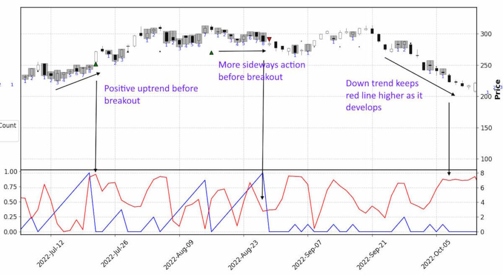
If we consider the two bullet points of potential trade signals I write about above, then zoom in on the chart our python code generated, we can identify:
A. Over on the left, a peaking red line (MLRR2) growing with the 8-count congestion count (numbered on candles and blue line). This perhaps tells us the break up from congestion might have more legs to it than if we were just considering the size of the congestion period. The big green buy marker only represents the 8 count break, as the marker size grows with the increasing count it breaks from.
B. Moving on to the next 7 count and then the 8 count after that, the red line is lower even though the congestion count is high, this may indicate a less certain breakout trend when it occurs.
C. Finally on the right there is a clear down trend in place and we can see the red line is confirming this. This doesn’t develop from a congestion breakout but makes it clear the red line identifies the trend we can clearly see.
So in ‘A’ we could perhaps interpret that the MMLR2 is telling us to have more confidence to hold a long (buy trade) than would be the case if looking at the scenarios in ‘B’ where you would be buying the next 7 count break up or selling (short trade) the subsequent 8 count breakdown.
You can see if you’d got involved on ‘A’ the price action did move to a new acceptance level of price nearer $300 from sub $250 but if you’d got involved in the ‘B’ congestion breakouts, the price action pretty much continued sideways after the supposed breakouts.
This is a very small sample and example but indicates some value might be there to be had. You could run this over larger and different data sets to see if it could be a winning formula and also change the parameters of the lookback. If you then run this over a bunch of different securities and commodities you could trigger alerts when these setups occur and bring up those charts for better analysis.
Key Takeaways
- Moving Linear Regression R Squared, when combined with congestion counts, offers a robust method for identifying potential trade signals in financial markets.
- Understanding congestion counts can help traders predict potential periods of price stability, followed by significant price moves.
- MLRR2 measures how closely data fits a linear trend, making it a valuable tool for identifying strong market trends. A high MLRR2 value indicates a strong trend, while a low MLRR2 value might suggest a lack of a clear trend.
- Applying MLRR2 and congestion counts simultaneously can enhance market trend predictions. For instance, a high MLRR2 value coupled with a high congestion count could suggest a strong, narrow-range market trend that may lead to a significant price move.
- Contrarily, a low MLRR2 value with a high congestion count might imply a market moving sideways within a narrow price range, potentially leading to a continuation of the sideways movement post congestion.
- Traders can use Python to visually represent and track these metrics over time, improving the accuracy and efficiency of their market analysis.
- Through examples, the post highlights that MLRR2 can sometimes indicate the likelihood of a congestion breakout leading to a significant price trend.
- With Python, it’s feasible to run this analysis over large and different datasets, potentially triggering alerts when particular setups occur, aiding in timely decision-making for traders.
- The combination of MLRR2 and congestion counts can potentially help traders to develop more confident and informed trading strategies.



Leave a Reply