
Introduction
Bollinger Bands are a popular technical analysis tool invented by John Bollinger in the 1980s. They are a type of trading band or envelope that provides relative definitions of high and low prices.
Origins
The concept of trading bands dates back to Wilfrid Ledoux in 1960, who used curves connecting the monthly highs and lows of the Dow Jones Industrial Average as a long-term market-timing tool. Over the years, various types of trading bands were developed, including Keltner bands, Donchian bands, and percentage bands. However, Bollinger noticed that these bands needed to be adjusted over time to keep them relevant to the price structure, which led to the creation of Bollinger Bands.
Mathematical Construction
So let’s look at how to calculate Bollinger Bands. They consist of three lines: a simple moving average (middle band), an upper band, and a lower band. The upper and lower bands are set at a specified number of standard deviations from the middle band. The default parameters are a 20-period moving average with the bands set at plus and minus two standard deviations of the same data used for the average.
The key feature of Bollinger Bands is their dynamic nature. They adapt to changing market conditions through the use of standard deviation, which measures price volatility. When the market becomes more volatile, the bands widen (move further away from the average), and during less volatile periods, the bands contract (move closer to the average).
The formula for Bollinger Bands is broken into four components:
- Middle Band (MB): The middle band is a simple moving average of the closing prices over a specified number of periods. If N is the chosen period, the calculation for the middle band (MB) would be:
MB = (Sum from i=1 to N of Close[i]) / N which is the same as:
MB = \frac{\sum_{i=1}^{N} \text{Close}[i]}{N}- Standard Deviation: The standard deviation (SD) is calculated over the same number of periods as the middle band. It measures the volatility of the price. The calculation for the standard deviation would be:
SD = sqrt((Sum from i=1 to N of (Close[i] – MB)²) / N) which is the same as:
SD = \sqrt{\frac{\sum_{i=1}^{N} (\text{Close}[i] - MB)^2}{N}}- Upper Band (UBB): The upper band is calculated by adding a multiple of the standard deviation to the middle band. If m is the chosen multiplier (typically 2), the calculation for the upper band would be:
UBB = MB + m * SD which is the same as:
UBB = MB + m \times SD
- Lower Band (LBB): The lower band is calculated by subtracting a multiple of the standard deviation from the middle band. Using the same multiplier m, the calculation for the lower band would be:
LBB = MB – m * SD which is the same as:
LBB = MB - m \times SD
In the text formulas, “sqrt” stands for the square root operation, “Sum from i=1 to N” represents the summation operation over the period from 1 to N, “Close[i]” is the closing price at period i, “SD” is the Standard Deviation, and “m” is the multiplier.
How Bollinger Bands Work
They provide a relative definition of high and low prices. By definition, price is high at the upper band and low at the lower band. This relative definition can be used to compare price action and indicator action to arrive at calculated buy and sell decisions.
Note that tags of the price touching the bands are just that, tags not signals. A tag of the upper Bollinger Band is not in-and-of-itself a sell signal, nor a tag of the lower Bollinger Band a buy signal. In trending markets, price can, and does, walk up the upper Bollinger Band and down the lower Bollinger Band.
How to Interpret Signals
Interpreting them involves understanding their dynamic nature and understanding what the Bollinger Bands’ width (difference between them, see BDIF later in this post) represents. When the bands contract, it indicates a period of low market volatility, often seen during sideways or non-trending markets or tat time when the market is waiting for some fundamental news. Conversely, when the bands’ width expands, it indicates a period of high market volatility, often seen during strong uptrends or downtrends or after an out of consensus fundamental release.
A common technique is to look for price “tags” of the bands. A tag of the upper band could indicate that the asset is becoming overbought, while a tag of the lower band could indicate that the asset is becoming oversold. However, as stated in the prior section these are not standalone signals and should be used in conjunction with other indicators or analysis techniques.
Pattern recognition in the context of a Bollinger Bands strategy refers to the ability to identify technical trading patterns within the price structure that might suggest future price movements. Here are a few examples of how they can aid in pattern recognition:
- Double tops and double bottoms: These are patterns where the price hits the upper or lower band twice without breaking through. A double top (at the upper band) is often seen as a bearish sign, while a double bottom (at the lower band) can be a bullish signal.
- Bollinger Band Squeezes: When the bands come close together (a ‘squeeze’), it indicates decreased volatility and can often precede a significant price movement. Traders look for periods of low volatility (the squeeze) as a potential sign of upcoming increased volatility and potential trading opportunities.
- Bollinger Bounces: This is based on the idea that price tends to return to the middle of the bands. Traders use this pattern to establish entry and exit points in range-bound markets.
- Bollinger Band Trends: Traders also look for patterns of successive tops or bottoms hitting the bands or the middle line, which can indicate a trend.
Pros and Cons
Pros:
- Dynamic Nature: They adjust automatically to changing market conditions, making them a versatile tool for traders. You can also alter how the middle band is calculated with different types of moving averages as we go on to explore later in this post.
- Multiple Uses: a Bollinger Bands strategy draws on information that can be used for a variety of purposes, including identifying overbought and oversold conditions, pattern recognition, and volatility measurement.
- Applicable to Various Markets: they can be used in various financial markets, including stocks, forex, commodities, and futures.
Cons:
- No Directional Bias: They do not provide any indication of future price direction. They need to be used in conjunction with other indicators or analysis techniques to determine the direction of the trend.
- False Signals: During periods of high market volatility, price can often “walk” the bands, leading to potential false signals.
Bollinger Bands Python
If looking to use Python to calculate the bands you would do it as follows:
import pandas as pd

def calculate_bollinger_bands(data, period=20, std_dev_multiplier=2):
    middle_band = data['Close'].rolling(window=period).mean()
    std_dev = data['Close'].rolling(window=period).std()
    upper_band = middle_band + std_dev * std_dev_multiplier  # Using the std_dev_multiplier
    lower_band = middle_band - std_dev * std_dev_multiplier

    return upper_band, middle_band, lower_band
In this Python code, data is a DataFrame that contains the close prices for each period. The function calculates the middle band as a simple moving average of the close prices over the specified period. The upper and lower bands are calculated as a specified number of standard deviations away from the middle band, this case 2, defined in the code as std_dev_multiplier=2.
Plotting these on a Chart
If you wish to plot the bands on a chart using free data and free software from Microsoft such as VSCode, then you can follow my Bollinger Bands Python tutorial below, which I have aimed to make beginner friendly.
First of all download VSCode and install Python if you haven’t already (I think there is a step by step guide within VSCode to do this from memory) else a quick google search will set you on your way. When you have Python installed, install the necessary libraries in the same directory as your Python installation. Inside VSCode you can use the Terminal at the base of the screen and enter the following instruction:
pip install yfinance mplfinance matplotlib pandas numpyThis command will install the necessary packages for Yahoo Finance (yfinance), Matplotlib Finance (mplfinance), Matplotlib (matplotlib), Pandas (pandas), and NumPy (numpy) which we use to download free ticker data, manipulate it and plot it.
Create a new bollinger.py file in VSCode and add the following code into it in the same order:
Part 1: Data Preparation and Bollinger Band Calculation
import pandas as pd
import yfinance as yf
import mplfinance as mpf
import matplotlib.pyplot as plt

# Download NVIDIA stock data from the start of a year ending June 25th, 2023
data = yf.download('NVDA', start='2022-06-25', end='2023-06-25')

# Calculate the middle band (20-day SMA)
data['MB'] = data['Close'].rolling(window=20).mean()

# Calculate the standard deviation
std_dev = data['Close'].rolling(window=20).std()

# Calculate the upper and lower BB
multiplier = 2
data['UBB'] = data['MB'] + (std_dev * multiplier)
data['LBB'] = data['MB'] - (std_dev * multiplier)

# Drop the first 20 rows which contain NaN values due to the rolling window calculation
data = data.dropna()

# Create a new DataFrame for the BB
bb = pd.DataFrame(index=data.index)
bb['UBB'] = data['UBB']
bb['MB'] = data['MB']
bb['LBB'] = data['LBB']
This part of the code is responsible for downloading the NVIDIA stock data, calculating the middle band as a 20-day Simple Moving Average (SMA), and determining the upper and lower Bollinger Bands. The NaN values that arise from the rolling window calculation are also removed.
Part 2: Plot Preparation
# Create a list of plots to be added
add_plots = [mpf.make_addplot(bb['UBB'], color='g', linestyle='dashed'),
             mpf.make_addplot(bb['MB'], color='b', linestyle='dashed'),
             mpf.make_addplot(bb['LBB'], color='r', linestyle='dashed')]
This part of the code prepares the additional plot elements. The upper, middle, and lower bands are configured to be displayed as dashed lines with different colors.
Part 3: Plotting and Chart
# Create a new figure and axes
fig, axes = mpf.plot(data, type='candle', style='yahoo', title='NVIDIA Stock Price with Bollinger Bands',
                     ylabel='Price ($)', addplot=add_plots, volume=True, figscale=1.25, figratio=(10, 7),
                     tight_layout=True, returnfig=True)

# Create custom legend
legend_lines = [plt.Line2D([0], [0], color='g', lw=2, linestyle='dashed'),
                plt.Line2D([0], [0], color='b', lw=2, linestyle='dashed'),
                plt.Line2D([0], [0], color='r', lw=2, linestyle='dashed')]

axes[0].legend(legend_lines, ['Upper Bollinger Band', 'Middle Band', 'Lower Bollinger Band'], loc='upper left')

# Show the plot
plt.show()
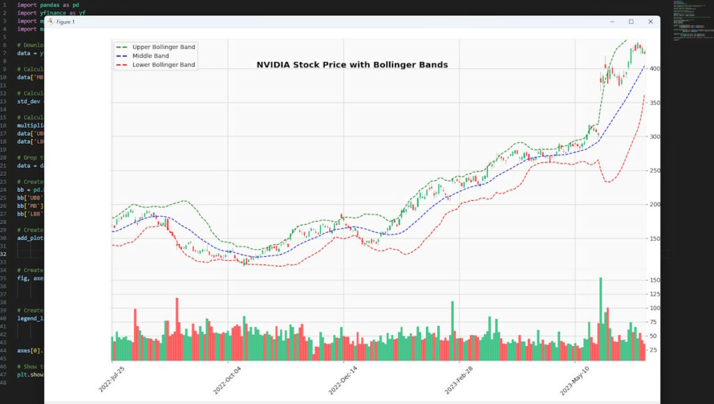
This then uses the mplfinance library to create a candlestick chart, adds the Bollinger Bands, includes the volume, and finally displays a custom legend for the bands.
Now save the file and press the play button in the top right of VSCode and you should then have a chart showing like mine below, any issues will appear in the Terminal tab if it’s not working for you.
Altering the Middle Band’s Moving Average
There are different options for the type of Moving Average you may wish to apply:
- Simple Moving Average (SMA): This is the moving average type we’ve already implemented in our code. It’s calculated by taking the arithmetic mean of a given set of values. In Python, it can be calculated using the
pandas.DataFrame.rolling().mean()function. - Smoothed Moving Average (SMMA): This is similar to a simple moving average, but instead of subtracting the oldest value, the previous smoothed average value is subtracted. In Python, it can be calculated as follows:
def calculate_smoothed_ma(data, period):
    return data['Close'].ewm(alpha=1/period, adjust=False).mean()
3. Exponential Moving Average (EMA): This type of moving average gives more weight to recent prices, which can make it more responsive to new information. In Python, it can be calculated using the pandas.DataFrame.ewm().mean() function.
def calculate_ema(data, period):
    return data['Close'].ewm(span=period, adjust=False).mean()
4. Weighted Moving Average (WMA): This moving average type assigns weights linearly, assigning greater weights to more recent data points. It’s not directly available in pandas, but can be calculated as follows:
def calculate_wma(data, period):
    weights = np.arange(1, period + 1)
    return data['Close'].rolling(period).apply(lambda prices: np.dot(prices, weights) / weights.sum(), raw=True)
5. Centered Moving Average (CMA): This is calculated the same as a simple moving average, but the first point is plotted at the center bar of the specified period. It’s not directly available in pandas, but can be calculated as follows:
def calculate_cma(data, period):
    offset = (period - 1) // 2
    return data['Close'].rolling(period).mean().shift(-offset)
6. Median Moving Average: This is simply the median value in a series. In Python, it can be calculated using the pandas.DataFrame.rolling().median() function.
def calculate_median_ma(data, period):
    return data['Close'].rolling(period).median()
7. Trix Moving Average: This is a triple smoothing of the data using exponential moving averages with the same smoothing constant. It’s not directly available in pandas, but can be calculated as follows:
def calculate_trix(data, period):
    ema1 = data['Close'].ewm(span=period, adjust=False).mean()
    ema2 = ema1.ewm(span=period, adjust=False).mean()
    ema3 = ema2.ewm(span=period, adjust=False).mean()
    return ema3
8. Exponential Hull Moving Average: This uses the difference between two exponential moving averages for the smoothing of the data. It’s not directly available in pandas, but can be calculated as follows:
def calculate_exponential_hull(data, period):
    ema_half_period = data['Close'].ewm(span=period/2, adjust=False).mean()
    ema_full_period = data['Close'].ewm(span=period, adjust=False).mean()
    diff = (2 * ema_half_period) - ema_full_period
    return diff.ewm(span=np.sqrt(period), adjust=False).mean()
Changing the MA Chosen for Our Chart
For each of these moving average types, you would replace the middle_band calculation in your calculate_bollinger_bands function with the appropriate function call. For example, if you choose to use an exponential moving average instead of a simple moving average, you would replace the line:
middle_band = data['Close'].rolling(window=period).mean()with:
middle_band = calculate_ema(data, period)Remember to import numpy at the beginning of your script if you’re using weighted, centered, trix, or exponential hull moving averages as the calculation includes the use of the square root function (np.sqrt) needing NumPy.
import numpy as npIf you instead choose to replace it with an Exponential Hull Moving Average, we need to add in the function for it so you would change the first part of you code shown in “Part 1: Data Preparation and Bollinger Band Calculation” above, to instead be:
import pandas as pd
import yfinance as yf
import mplfinance as mpf
import matplotlib.pyplot as plt
import numpy as np


def calculate_exponential_hull(data, period):
    ema_half_period = data['Close'].ewm(span=period/2, adjust=False).mean()
    ema_full_period = data['Close'].ewm(span=period, adjust=False).mean()
    diff = (2 * ema_half_period) - ema_full_period
    return diff.ewm(span=np.sqrt(period), adjust=False).mean()

# Download NVIDIA stock data from the start of the year to June 25th, 2023
data = yf.download('NVDA', start='2022-06-25', end='2023-06-25')

# Calculate the middle band using Exponential Hull Moving Average
data['MB'] = calculate_exponential_hull(data, period=20)

# Calculate the standard deviation
std_dev = data['Close'].rolling(window=20).std()

# Calculate the upper and lower BB
multiplier = 2
data['UBB'] = data['MB'] + (std_dev * multiplier)
data['LBB'] = data['MB'] - (std_dev * multiplier)

# Drop the first 20 rows which contain NaN values due to the rolling window calculation
data = data.dropna()

# Create a new DataFrame for the BB
bb = pd.DataFrame(index=data.index)
bb['UBB'] = data['UBB']
bb['MB'] = data['MB']
bb['LBB'] = data['LBB']
The main change in the code above as highlighted is the introduction of the calculate_exponential_hull function and the replacement of the middle band calculation with the Exponential Hull Moving Average. This new approach takes into account the exponential weighting of the data and is believed to be more responsive to recent price changes.
The rest of the code (Part 2 and Part 3) remains the same as previously explained, and the plot will now reflect the Exponential Hull Moving Average as the middle band of the Bollinger Bands. Remember to close any existing chart, save the file and generate the new one same as before, you should then see the new chart, same as mine:
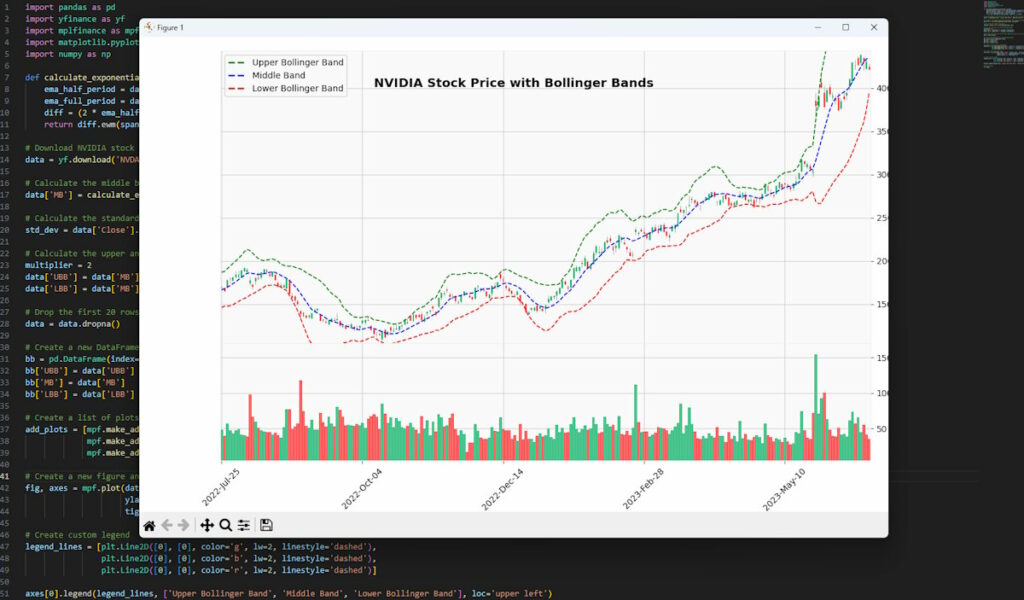
Compared to our first chart the price action is now much more contained. It’s only the middle band calculation you would tend to edit as the upper and lower bands typically involve adding and subtracting a certain number of standard deviations from the middle band. This aspect usually remains consistent regardless of the type of moving average used for the middle band.
Having said that there’s nothing to stop you experimenting with different variations and combinations of moving averages for all three bands, but that would be a more specialized adaptation.
Bollinger Band Difference (BDIF)
The Bollinger Band Difference (BDIF) measures between the upper and lower Bollinger Bands’ width. It’s an essential metric for traders who want to gauge the market’s volatility and potential trend strength.
- Interpreting BDIF:
- Increasing BDIF: An increase in the BDIF is often a sign that the market is experiencing higher volatility. It may also indicate the beginning of a new trend, as the bands widen due to price fluctuations.
- Decreasing BDIF: A decrease in the BDIF can signal a reduction in market volatility, often accompanying a consolidating or range-bound market.
- Trading Strategies with BDIF:
- Trend Following: Traders can use an increasing BDIF as a confirmation of a strong trend and might decide to enter trades in the direction of the prevailing trend.
- Reversal Identification: Conversely, a sudden decrease in BDIF after a prolonged increase might be seen as a potential trend reversal, prompting traders to close positions or take the opposite trade.
- Combination with Other Indicators: BDIF can be combined with other technical indicators like RSI or MACD to create a robust trading system. For example, a high BDIF with an overbought RSI might signal a potential short opportunity.
- Example of Using BDIF in Trading: If the BDIF starts to increase steadily along with a rising price, the trader might interpret this as the beginning of an uptrend. If the increase in BDIF continues, it’s usually a sign of a continuing trend, and the trader might decide to enter a long position. On the other hand, if the BDIF starts to decrease while the price is near the upper Bollinger Band, it could be a sign of an overextended market, and the trader might decide to take profits or enter a short position.
To calculate the Bollinger Band Difference in Python, you would first calculate the upper and lower bands, and then subtract the lower band from the upper band. Here’s how you could modify your calculate_bollinger_bands function to also return the BDIF:
def calculate_bollinger_bands_and_bdif(data, period=20, std_dev=2):
    middle_band = data['Close'].rolling(window=period).mean()
    std_dev = data['Close'].rolling(window=period).std()
    upper_band = middle_band + std_dev * std_dev_multiplier
    lower_band = middle_band - std_dev * std_dev_multiplier
    bdif = upper_band - lower_band
    return upper_band, middle_band, lower_band, bdif
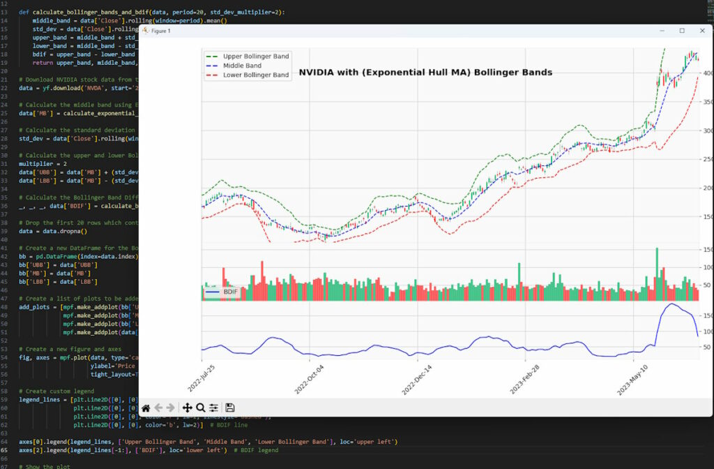
In this code, bdif is the Bollinger Band Difference, which is simply the upper band minus the lower band. This value represents the width of the Bollinger Bands and can be used to measure market volatility.
Making a few adjustments to add this into our existing code from the prior chart we get the following chart now with a BDIF panel:
Bollinger Bands Formula for Excel
Perhaps you’re not keen on Python and wish to create them in Excel. For this I take some daily data for AMD stock from Nasdaq selecting the 1Y option then ‘Download Data’ option.
- Setup Your Spreadsheet: Input your data into Excel. You’ll need a column for the date and a column for the closing price. Make sure to sort your data by date, from oldest to newest. If using the AMD Nasdaq data set, column B has the close data, select the column then Find & Select>Replace and put $ in the ‘Find what’ box and leave the ‘Replace with’ box empty then click the ‘Replace all’ button. Then with column B selected, right click>Format Cells and select ‘Number’ then press the OK button. I’m only keeping columns A and B for this example. We need to reverse the data sorted by date so the oldest close is at the top of the column, so select column A, Sort & Filter > Oldest to Newest and expand the selection.
- Calculate the Simple Moving Average (SMA): The SMA will serve as the middle band (MB) in the Bollinger Bands formula. In Excel, you can use the AVERAGE function combined with the OFFSET function to calculate the SMA. To create a rolling 20-day SMA, use the formula
=AVERAGE(OFFSET(B2,-19,0,20,1)), where B2 is the cell containing the 20th close in your data. Drag this formula down to apply it to all your cells. It will automatically adjust to calculate the 20-day SMA for each day, giving you a rolling SMA. Please note that your first 19 cells for SMA will be blank (showing ‘#REF!’) or you can manually calculate them based on the available data. - Calculate the Standard Deviation (SD): The SD of the closing price will be used to create the upper and lower bands in the Bollinger Bands formula. In Excel, you can use the
STDEV.Pfunction combined with theOFFSETfunction to calculate the standard deviation. For a rolling 20-day standard deviation, use the formula=STDEV.P(OFFSET(B2,-19,0,20,1)), where B2 is the cell containing the 20th closing price in your data. As with the SMA, drag this formula down to apply it to all your cells. This formula calculates the standard deviation of the same 20 closing prices that were used to calculate the corresponding SMA. This method provides a measure of the volatility of the price over the 20-day period. - Calculate the Upper Band (UBB): The UBB is calculated as
MB + m * SD, where MB is the middle band, m is the multiplier (generally set to 2), and SD is the standard deviation. In Excel, if your middle band is in column C and your standard deviation is in column D, you could use the formula=C2 + 2*D2in the second row (replace 2 with your preferred multiplier). - Calculate the Lower Band (LBB): The LBB is calculated as
MB - m * SD, where MB is the middle band, m is the multiplier (generally set to 2), and SD is the standard deviation. In Excel, if your middle band is in column C and your standard deviation is in column D, you could use the formula=C2 - 2*D2in the second row (replace 2 with your preferred multiplier). - Calculate the %B Indicator: The %B indicator tells us where we are within the bands. If it’s 1, we are at the upper band, and if it’s 0, we are at the lower band. If the %B is greater than 1, we are above the upper band, and if it’s less than 0, we are below the lower band. In Excel, you can use the formula
=(B2 - E2) / (D2 - E2), where B2 is the closing price, D2 is the upper band, and E2 is the lower band. - Apply the Formulas: After calculating the SMA, SD, UBB, and LBB for the first 20 closes, drag each formula down to apply it to all your cells. This will give you a rolling calculation for each day in your data.
Please note that these calculations assume that you have at least 20 previous data points. If you have fewer than 20 data points, you’ll need to adjust these calculations accordingly.
We can do a rough and ready check to see what we are making by creating an unpretty plot and comparing it to something like Yahoo Finance’s chart with the same parameters for the bands and same date range:
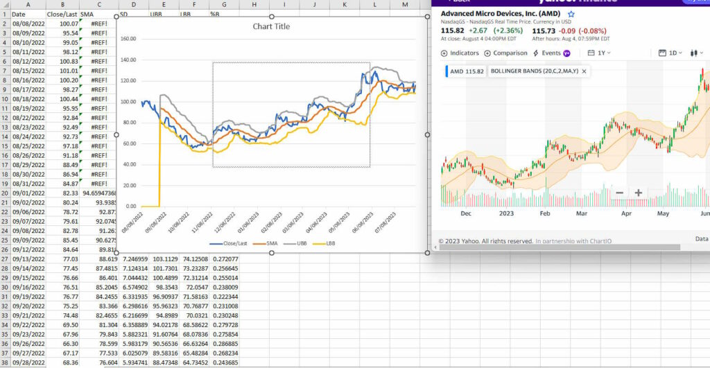
While it’s not pretty it tells us we can use the data in the columns with some level of confidence for other purposes. You can obviously go on to finesse this.
Bollinger Bands Strategy Examples
The practical application of the bands can be understood by considering real-world examples.
Example 1: Identifying Overbought and Oversold Conditions
Suppose you’re trading a stock and you notice that the price has reached the upper Bollinger Band. This could indicate that the stock is becoming overbought, and you might decide to take profits or short the stock. Conversely, if the price reaches the lower Bollinger Band, this could indicate that the stock is becoming oversold, and you might decide to buy the stock or close your short position.
Perhaps you would bolster this decision making with candlestick patterns or other indicators such as RSI that confirm the potential signals from the bands for added confidence.
Example 2: Recognizing Volatility Shifts
Suppose you’re trading a forex pair and you notice that the bands have started to expand after a period of contraction. This could indicate that the market is becoming more volatile, and you might decide to adjust your trading strategy accordingly. For example, you might decide to trade smaller position sizes to manage your risk, or you might look for trading strategies that perform well in volatile markets.
Comparison with Other Indicators
Bollinger’s bands can be compared to other technical analysis tools. For instance, the Average True Range (ATR) is another tool that measures market volatility. However, while Bollinger Bands provide a visual representation of volatility and price levels, the ATR provides a single value that represents volatility.
Another tool to compare is the Moving Average Convergence Divergence (MACD). While Bollinger Bands provide information about volatility and overbought/oversold conditions, the MACD provides information about the momentum and trend of the market.
Key Takeaways
- The bands were developed by John Bollinger to offer relative definitions of high and low prices.
- Composed of three lines, the tool’s middle line is a simple moving average, while the upper and lower lines are set at a specified number of standard deviations from the middle line.
- This method adapts to market volatility using standard deviation, with the lines expanding and contracting accordingly.
- It can help identify potential extremes in price (overbought or oversold conditions), shifts in market volatility, and various price patterns.
- While useful, this technique doesn’t offer future price direction indications and can lead to false signals in highly volatile markets.
- The Difference (BDIF) between the upper and lower lines provides an indicator of market volatility and potential trend strength.
- Tools like Python and Excel can be utilized for calculation and visualization, with Python being particularly suited due to its powerful data handling and plotting capabilities.
- The middle line can be calculated using different types of moving averages, each offering a different sensitivity to recent price changes to finesse your Bollinger Bands strategy.
- Combining this technique with other technical analysis tools and indicators can help make more informed trading decisions.
Further Reading
“Bollinger on Bollinger Bands” by John Bollinger, McGraw Hill (2001)



Leave a Reply