Do you go through an emotional rollercoaster every time you approach day trading? Do you want to gain more certainty and come out on top? If so, you’ve come to the right place. Our guide, “How to Use the Best Indicators for Day Trading and Win Big,” is here to help you simplify the complexities of trading and make more informed decisions.
In this article, we’ll cover one of the most crucial aspects of day trading: indicators. We’ll discuss not one or two but 10 technical analysis trading indicators for use in Futures trading, CFD trading, and FX trading intraday. Our experts have explained how each one of these indicators is constructed, what signals they provide, and their pros and cons.
We know that as a day trader, time is money, and that’s why we’ve created this comprehensive guide to save your time and energy. From understanding often debated difference between a leading and a lagging indicator, to mastering the best timeframe to apply each indicator to, we’ve got you covered. If you want to go more in depth on any indicator we have linked to our dedicated articles on each which tend to include free python scripts too.
So grab a cup of coffee (careful it is Friday the 13th!), sit back and let us be your guiding light as we explore how you can leverage these indicators and make the most of your trading strategy.
Understanding Technical Indicators for Day Trading
Introduction
Technical indicators play a vital role in day trading. These indicators help traders to identify trends, price movements, and market momentum. Intraday trading requires quick decisions, which is why traders use several technical indicators to make informed choices. In this section, we’ll discuss the 10 best technical indicators for day trading.
Leading vs. Lagging Indicators: A Nuanced Distinction
Indicators are broadly categorized into two groups: leading and lagging. Leading indicators are believed to precede price movements, offering predictive insights into potential future market trends. They are often used in an attempt to spot early signs of market reversals. Examples include the Relative Strength Index (RSI) and the Stochastic Oscillator. On the other hand, lagging indicators provide information based on historical data, serving as a confirmation tool for established trends. Moving averages are classic examples of lagging indicators. However, it’s essential to approach this distinction with a nuanced understanding.
While the categorization suggests a temporal sequence, the reality is that all indicators, whether deemed leading or lagging, derive their values from past market data. Thus, in a strict sense, every indicator is inherently “lagging.” The subjectivity lies in how traders interpret and apply these indicators, with some believing certain tools can offer a glimpse into future price actions, while others see them as mere reflections of past movements.
Moving Averages
A widely-used tool in technical analysis is Moving Averages. Traders and analysts rely on this fundamental technique to pinpoint trends, enabling them to make informed decisions about buying and selling financial instruments like commodities, stocks, or forex. The concept of moving averages is relatively old, tracing back to the inception of technical analysis use in the West during the late 19th and early 20th century. Traders have been using moving averages as one of the simplest ways to identify trends and make investment decisions since then.
A moving average essentially calculates the average price of a security over a specified number of periods. The average can be taken for any period that is relevant, such as days, weeks, or months, and is designed to ‘smooth’ out the price fluctuations and reduce the impact of volatility.
Different types of moving average exist that apply various weights to data points. Some examples include simple moving averages (SMA), weighted moving averages (WMA), and exponential moving averages (EMA).
- Simple Moving Average (SMA): This is the simplest form of a moving average. It calculates the average price of a security over a specific number of periods. The formula is: SMA = (Sum of price observations / Number of observations)
- Weighted Moving Average (WMA): This type of moving average assigns a heavier weight to the more recent data points. The idea is to give more importance to recent price changes. The formula is: WMA = (Sum of (Price * Weighting factor)) / (Sum of Weighting factor)
- Exponential Moving Average (EMA): This is a more complex type of moving average that gives more weight to recent price data and less to older data. It is more reactive to recent price changes compared to the SMA or WMA. The formula is: EMA = (Closing price – Previous day’s EMA) * (2/(Selected time period + 1)) + Previous day’s EMA.
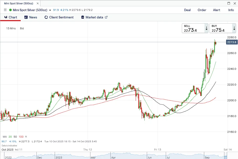
Moving averages have several advantages. They are straightforward to calculate and understand, making them accessible for beginners. They can help identify trends in a volatile market, providing clear signals when the price moves above or below the moving average line. Furthermore, they can also act as support or resistance levels, informing traders of potential reversals.
However, moving averages also have certain drawbacks. They are lagging indicators, which means they only reflect past prices and may not predict future trends accurately. They also may not work well in range-bound or sideways markets, and sudden price movements can give false signals.
Several other technical indicators are derived from moving averages, such as Moving Average Convergence Divergence (MACD), Bollinger Bands, and Ichimoku Cloud. These indicators combine moving averages with other mathematical formulas to provide more comprehensive analysis of the market trends and volatility.
As for intra-day trading, moving averages can be especially beneficial. When the market is open, prices can fluctuate rapidly due to high trading volumes and news releases. Moving averages can help smooth out these price fluctuations and provide a clearer picture of the underlying trend. By selecting shorter time periods for their moving averages, intra-day traders can track shorter-term price fluctuations and trends, which are crucial for making quick trading decisions.
Moreover, moving averages can help intra-day traders identify potential entry and exit points. When the price crosses above the moving average, it is considered a bullish signal which could indicate a favourable buying opportunity. Conversely, if the price falls below the moving average, it might mean prices will drop further and indicate a selling opportunity could be present.
In summary, moving averages are a vital tool for traders, including intra-day traders. They help to identify market trends, provide potential buy and sell signals, and can be used as a basis for more complex indicators. However, they should be used in conjunction with other technical and fundamental analysis.
MACD
The Moving Average Convergence Divergence (MACD) is a momentum-based trend-following indicator used in technical analysis. It was developed by Gerald Appel in the late 1970s and has since been widely adopted by traders to identify new trends, whether bullish or bearish.
The MACD is calculated using exponential moving averages (EMAs), and its calculation involves three steps:
- MACD Line: Subtract the 26-period EMA from the 12-period EMA.
- Signal Line: Calculate the 9-period EMA of the MACD line.
- MACD Histogram: Subtract the Signal Line from the MACD Line.
MACD = (12-Period EMA) – (26-Period EMA)
Signal Line = 9-Period EMA of the MACD
Histogram = MACD Line – Signal Line
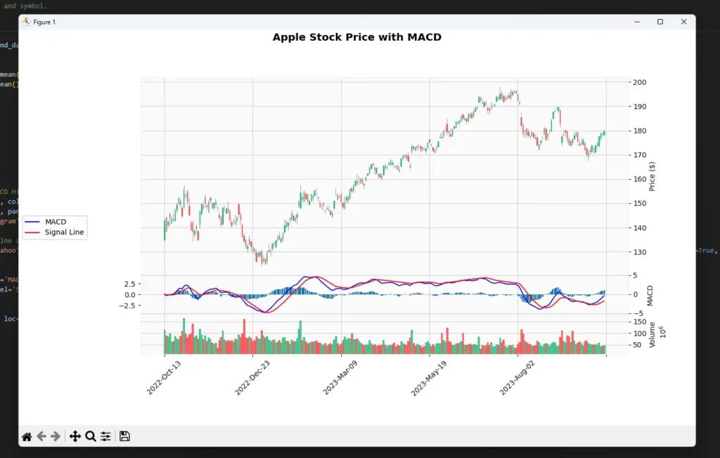
The MACD line, Signal line, and Histogram are all plotted on a single chart, with the MACD and Signal lines plotted against the zero line, and the Histogram plotted around the zero line. The “zero line” is a horizontal line drawn on the MACD chart at the level of zero. When the 12-period EMA is above the 26-period EMA, the MACD is positive and will be plotted above the zero line. Conversely, when the 12-period EMA is below the 26-period EMA, the MACD is negative and will be plotted below the zero line. The zero line, therefore, effectively represents the point at which the two EMAs are equal.
To create MACD in Python check out this article.
The MACD provides several types of trading signals:
- Crossovers: When the MACD line crosses above the Signal line, it generates a bullish signal (a signal to buy). Conversely, when the MACD line crosses below the Signal line, it provides a bearish signal (a signal to sell).
- Divergences: If the price of the asset makes a new high/low but the MACD doesn’t, it may indicate a potential trend reversal.
- Zero Line Crossovers: A bullish signal occurs when the MACD line crosses above the zero line, it signifies that the shorter-term EMA (12-period) has crossed above the longer-term EMA (26-period) and a bearish signal occurs when it crosses below the zero line for the opposite reason.
- Histogram Reversals: When the MACD histogram changes direction, it can signal the end of a bullish or bearish trend. This is because when the MACD line is above the Signal line, the Histogram is positive (above the zero line), indicating bullish momentum. Conversely, when the MACD line is below the Signal line, the Histogram is negative (below the zero line), indicating bearish momentum.
One of the benefits of MACD is that it incorporates aspects of both momentum and trend in one indicator. It can be beneficial in identifying potential buy and sell signals, recognizing trend reversals, and confirming other technical indicators.
However, like any other technical indicator, MACD is not fool proof. It can produce false signals during a choppy or flat market, and as a lagging indicator, it may not accurately predict future price movements. Traders should use the MACD in conjunction with other indicators and analysis methods to confirm signals.
In the context of intra-day trading, MACD can be particularly useful due to its ability to highlight short-term trends and momentum. MACD’s sensitivity to market movements can allow traders to take advantage of quick price changes during the trading day. When used correctly, the MACD can alert traders to trend changes within the day’s trading activity, which can be crucial for timely entry and exit decisions.
Additionally, using the MACD in conjunction with other intra-day trading tools and techniques, such as chart patterns or other technical indicators, can provide additional confirmation of potential trading opportunities. To trade with the MACD indicator intraday, one needs to be disciplined, manage risks effectively, and have a clear grasp of how the tool functions.
Bollinger Bands
Bollinger Bands are a volatility indicator used in technical analysis, invented by John Bollinger in the 1980s. They are used to identify potential overbought and oversold conditions in the market and can also help determine periods of high and low volatility.
Bollinger Bands consist of three lines:
- Middle Band: This is typically a simple moving average (SMA) of 20 periods, though the time frame can be adjusted based on the trader’s preference.
- Upper Band: Calculated as the middle band plus two standard deviations of the price.
- Lower Band: Calculated as the middle band minus two standard deviations of the price.
The basic assumption is that prices tend to stay within the upper and lower bands. When the price of a stock or security continuously touches the upper band, analysts consider it to be overbought. Conversely, when it touches the lower band, they consider it to be oversold.
Bollinger Bands generate several types of trading signals:
- Bollinger Bounce: Prices often “bounce” off the Bollinger Bands. The price hitting the upper band could be a selling signal, while hitting the lower band could be a buying signal.
- Bollinger Squeeze: A squeeze happens when the bands come close together, indicating low volatility. Traders expect a significant price movement, called a “Bollinger Band breakout,” after a squeeze.
- Riding the Bands: During a strong trend, price can ride along the upper or lower band, which can signal the continuation of a trend.
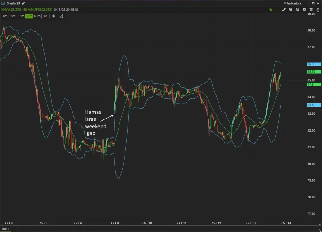
The benefits of Bollinger Bands include their ability to adapt to changing market conditions, their usage in various time frames, and their ability to provide dynamic support and resistance levels. They also work well in conjunction with other technical indicators.
However, Bollinger Bands also have their drawbacks. They perform poorly when markets are choppy or range-bound. Also, a touch of the upper or lower band does not necessarily mean it’s time to buy or sell; prices can often run along the band for extended periods during a strong trend.
In the context of intra-day trading, Bollinger Bands can be quite useful. The bands provide dynamic levels of support and resistance that can help traders understand the range in which the price is likely to stay during the trading day. Furthermore, the Bollinger Squeeze can be useful in predicting breakouts in the price. Also, intra-day traders often use Bollinger Bands in conjunction with other indicators, such as the Relative Strength Index (RSI), to increase the reliability of buy and sell signals.
In summary, while Bollinger Bands can be a valuable tool for intra-day traders, they should be used in combination with other indicators and methods to confirm trading signals and minimize false alarms. As with any trading tool, the accuracy of Bollinger Bands depends on a trader’s ability to interpret signals and integrate them into a well-developed trading strategy. The success of its application is key, which hinges upon proper analysis and planning before entering trades.
RSI
The Relative Strength Index (RSI) is a momentum oscillator that measures the speed and change of price movements. It was developed by J. Welles Wilder Jr. and introduced in his 1978 book “New Concepts in Technical Trading Systems”.
The RSI is calculated based on price changes over a specified period of time, typically 14 periods. The calculation formula is:
RSI = 100 – 100 / (1 + RS)
where:
RS (Relative Strength) = Average gain of up periods during the specified time frame / Average loss of down periods during the specified time frame
The RSI oscillates between zero and 100. Traditionally, the RSI is considered overbought when above 70 and oversold when below 30.
The RSI can generate several types of trading signals:
- Overbought and Oversold Conditions: When the RSI exceeds 70, it may indicate that the asset is overbought, suggesting a possible price pullback or reversal. Conversely, if the RSI falls below 30, it may indicate that the asset is oversold, suggesting a potential price bounce.
- Divergences: Divergences occur when the price of an asset and the RSI are moving in opposite directions. If the price makes a new high or low but the RSI doesn’t, it could be a sign of a potential trend reversal.
- Center line Crossover: The 50 level often serves as a baseline in the RSI. When the Relative Strength Index (RSI) crosses above 50, it indicates a bullish signal. On the other hand, when it crosses below 50, it suggests a bearish signal.
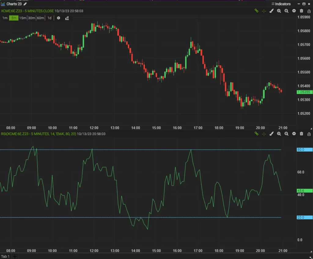
The RSI has several benefits. This indicator is adaptable and suitable for any market circumstances- be it trending, non-trending, volatile or non-volatile. It’s useful in identifying overbought or oversold conditions, detecting divergences, and confirming other trading signals.
However, there are also drawbacks. The RSI can stay in overbought or oversold conditions for extended periods during strong uptrends or downtrends, leading to premature or false signals. Furthermore, it’s important to note that relying solely on one technical indicator is not advisable. To achieve a comprehensive analysis, traders should incorporate other indicators and analysis methods in conjunction.
For intra-day traders, the RSI can be especially beneficial. Its sensitivity to micro-changes in the market makes it an effective tool to help traders capitalize on short-term price movements. Traders can use the RSI to determine the most opportune moments to enter or exit trades based on overbought or oversold conditions.
Furthermore, identifying divergences between price action and the RSI can help intra-day traders spot potential reversals. This can be particularly valuable in volatile intra-day markets where price swings can occur rapidly and with little warning.
However, because the RSI can remain overbought or oversold for prolonged periods, intra-day traders should be cautious about relying on these signals exclusively. Combining the RSI with other tools and indicators can help to validate signals and improve the overall effectiveness of an intra-day trading strategy.
DMI
The Directional Movement Index (DMI) is a technical indicator used to determine the strength of a trend in an asset’s price.J. Welles Wilder Jr., who also created the Relative Strength Index (RSI), introduced the DMI in his 1978 book, “New Concepts in Technical Trading Systems.”
The DMI consists of three different lines:
- Plus Directional Movement Indicator (+DI): Measures upward price pressure.
- Minus Directional Movement Indicator (-DI): Measures downward price pressure.
- Average Directional Index (ADX): Measures the strength of the trend, whether upward or downward. The ADX is derived from the smoothed average of the difference between +DI and -DI, and its values range from 0 to 100.
The basic DMI calculation is somewhat complex, as it involves comparing the differences in the highs and lows of consecutive periods, and then smoothing these values over a given period (typically 14 days). After that, the +DI and -DI are calculated by dividing the smoothed Plus Directional Movement (+DM) and Minus Directional Movement (-DM) by the Average True Range (ATR), and multiplying by 100.
The ADX is calculated differently, specifically it takes the smoothed moving average of the absolute difference between +DI and -DI and then divides it by the sum of +DI and -DI. The result is then multiplied by 100.
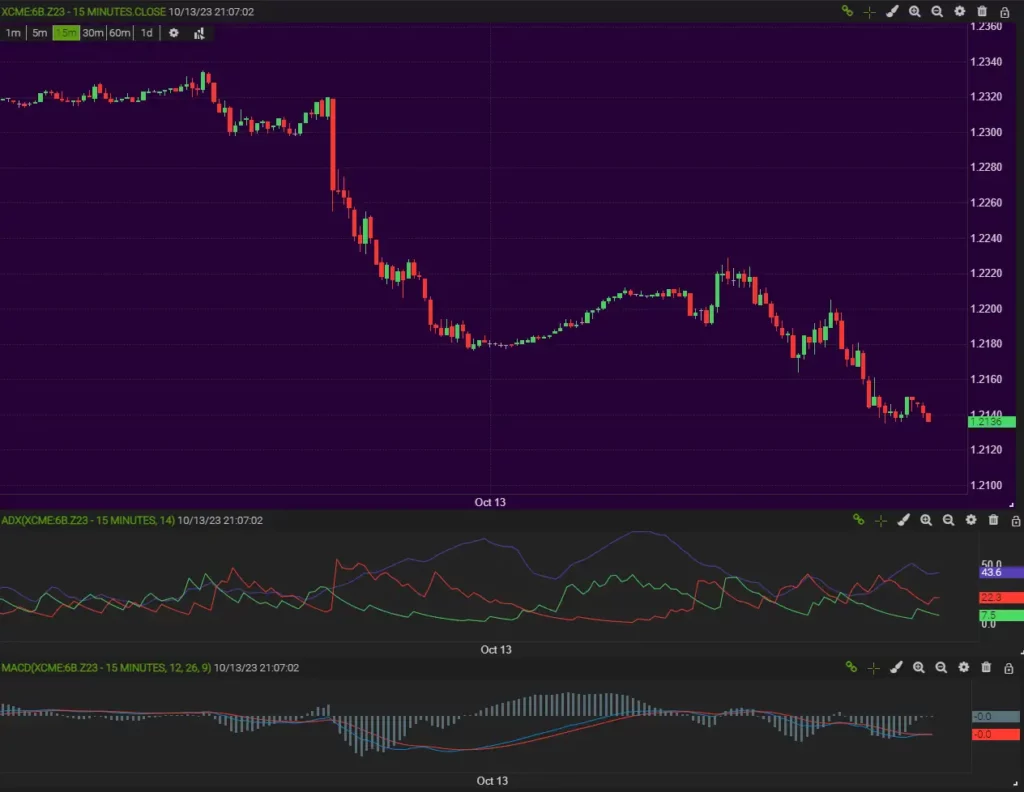
Signals generated by DMI include:
- Crossovers: A buy signal is generated when +DI crosses above -DI and the ADX line is above 20, indicating a strong upward trend. A sell signal is generated when -DI crosses above +DI and the ADX is above 20, indicating a strong downward trend.
- Strength of Trend: Generally, an ADX reading above 25 suggests a strong trend, while a reading below 20 suggests a weak trend or a ranging market.
Wilder also suggests that when a crossover occurs, the the most extreme price achieved during the crossover interval, might also be considered as a point for reversal.
The DMI’s strength lies in its ability to identify the strength and direction of a trend, allowing traders to filter out weak trends and focus on strong trends. However, the DMI can give false signals during choppy or range-bound markets, and like all indicators, it should be used in conjunction with other forms of analysis.
In terms of intra-day trading, the DMI can be particularly useful because it allows traders to identify when a strong trend might be in place. For traders using strategies predicated on trending markets, such as breakout strategies or trend following, this can be an invaluable tool.
However, as with any technical indicator, the DMI should be used as part of a broader trading strategy that incorporates other forms of analysis. This is particularly true in intra-day trading where the shorter time frames can increase the likelihood of false signals. Also, due to the volatility often found in intra-day markets, it’s advisable to use the DMI in conjunction with volatility measures and other indicators to provide further confirmation of signals.
For further information about this indicator and DDIF read our dedicated article on the Directional Movement Index here.
VWAP
The Volume Weighted Average Price (VWAP) is a trading benchmark widely used by traders that gives the average price a security has traded at throughout the day, based on both volume and price. It was first used by institutional traders and mutual funds as it provides a real-time snapshot of a security’s demand, but has become popular among retail traders as well. The idea of VWAP has been about since the time intraday trading data came into existence. However, it gained more prominence in the late 20th and early 21st century due to algorithmic trading’s emergence as a dominant force.
Mathematically, VWAP is calculated by adding up the dollars traded for every transaction (price multiplied by the number of shares or contracts traded) and then dividing by the total shares or contracts traded for the day.
The formula for VWAP is:
VWAP = ∑ (Price * Volume) / ∑ Volume
VWAP essentially acts as a true average of the day’s price action, taking into account the volume at each price level, rather than just the price itself.
When an asset’s price is higher than the VWAP line, it may indicate a bullish signal. Conversely, if the price falls below the VWAP, it may indicate a bearish signal. Traders may also look for VWAP crosses, where the price crosses above or below the VWAP line, as potential trading signals.
The benefits of using VWAP for intra-day trading are numerous. Primarily, VWAP can provide levels of support and resistance throughout the day, helping traders make better decisions about entries and exits. Additionally, because it’s widely used, VWAP can become a self-fulfilling prophecy: If many traders are watching it and acting on similar signals, it can magnify its influence on price action. VWAP also provides a fair value reference point.
One of the main drawbacks of VWAP is that it’s cumulative and therefore becomes less sensitive to new price action as the day progresses. This can make it less relevant for traders later in the day. Additionally, like all indicators, it should not be used in isolation and can produce false signals. It’s most effective when used in conjunction with other indicators and tools.
Overall, the VWAP can be an essential tool for intra-day traders, particularly in terms of identifying fair value and levels of support and resistance. When used appropriately, and in combination with other analysis methods, it can significantly enhance a trader’s ability to navigate the market effectively.
How does it compare to the value area in Market Profile?
Market Profile, developed by trader Peter Steidlmayer in the 1980s, is a statistical analysis of price data which displays price on a vertical axis against time on a horizontal axis. This creates a bell curve distribution, known as a ‘market profile’, over a trading session. This profile illustrates where the market spent the most time trading (typically where the most volume occurred), which is often referred to as the Point of Control (POC), and a ‘value area’ which encompasses one standard deviation of volume around the POC.

The VWAP, on the other hand, provides a snapshot of the average price based on both price and volume throughout the trading day. The VWAP line itself represents the average price that all traders have traded at for the day.
Both concepts—Market Profile and VWAP—aim to identify where the market perceives value. They’re similar in that they both take volume into account and are designed to highlight areas where the majority of trading activity has taken place.
The ‘value area‘ in Market Profile and the VWAP line can often align because they’re both gauging where the most trading activity (volume) has occurred. When these areas align, it can often act as a strong area of support or resistance because it represents a price that the majority of market participants have deemed as ‘fair value’.
When used together, VWAP and Market Profile can provide powerful insights for traders. For instance, if the price is trading below the VWAP and also below the value area low, this could be a sign that the asset is being undervalued, and there may be an opportunity for a long trade. Conversely, if the price is above the VWAP and also above the value area high, this could suggest overvaluation and a potential opportunity for a short trade. You should also consider where these values were for the prior day and whether today’s fair value gets rejected later in the session in favour of trading back towards yesterday’s instead.
Stochastic Oscillator
The Stochastic Oscillator is a momentum indicator that was developed by Dr. George Lane in the 1950s. It compares a particular closing price of a security to a range of its prices over a certain period.
The Stochastic Oscillator consists of two lines: %K, which is the main line, and %D, which is a moving average of %K.
The formulas for the two lines are as follows:
%K = 100[(C – L14)/(H14 – L14)]
%D = 3-period simple moving average of %K
In the formulas, C is the most recent closing price, L14 is the lowest price traded of the 14 previous trading sessions, and H14 is the highest price traded during the same 14-day period.
The Stochastic Oscillator generates values between 0 and 100. If a reading is above 80, it suggests that the asset is overbought. Alternatively, if it falls below 20, the asset may be oversold.
Signals to buy or sell are created when the two lines, %K and %D, cross. For instance, a buy signal is generated when the %K line crosses above the %D line and the values of the oscillator are below 20 (the asset is oversold). Conversely, a sell signal is generated when the %K line crosses below the %D line and the values of the oscillator are above 80 (the asset is overbought).
The Stochastic Oscillator can be beneficial for intra-day traders because it offers a quick visual guide to trend momentum and potential reversals. As it is range-bound, it is also useful in different market conditions, whether trending or range-bound.
However, the oscillator can provide false signals in trending markets. A strong uptrend or downtrend can cause prices to remain overbought or oversold for extended periods. This is why it’s crucial to use the Stochastic Oscillator in conjunction with other indicators or technical analysis methods to confirm trading signals. There are two main variations of the stochastics oscillator used in trading generally known as Fast Stochastics which is the original and Slow Stochastics with additional smoothing.
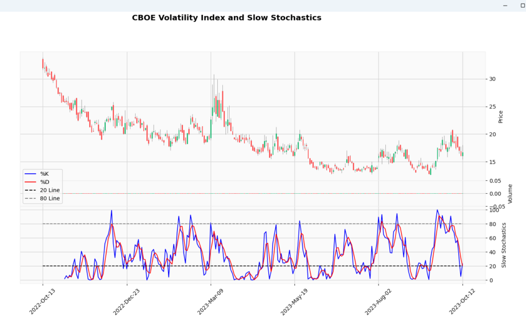
The Stochastic Oscillator can come in handy for intra-day trading. It is particularly useful in identifying overbought and oversold conditions over a short period. This helps traders spot potential opportunities to buy at perceived lower prices and sell at higher ones. However, due to the high frequency of trading and increased volatility during the day, intra-day traders should be wary of false signals and use additional confirmation methods for their trades.
OBV
On Balance Volume (OBV) is a momentum indicator that uses volume flow to predict changes in stock price. It was developed by Joe Granville and introduced in his 1963 book, “Granville’s New Key to Stock Market Profits”.
The principle behind OBV is that changes in volume often precede price changes, making it a leading indicator. The concept is straightforward: it adds volume on days when the price rises and subtracts volume on days when the price falls.
Mathematically, the OBV is calculated as follows:
- If today’s closing price is higher than yesterday’s closing price, then: OBV = Yesterday’s OBV + today’s volume
- If today’s closing price is lower than yesterday’s closing price, then: OBV = Yesterday’s OBV – today’s volume
- If today’s closing price equals yesterday’s closing price, then: OBV = Yesterday’s OBV
Buy and sell signals are generated by observing divergences and changes in the direction of OBV. For instance, if the OBV is rising while the price is falling or flat, it could indicate that a price increase is imminent. Conversely, if the OBV is falling while the price is rising or flat, it could suggest that a price drop is coming.
Another approach is to use OBV to confirm trends. If the price is rising and OBV is rising too, it confirms the upward trend. If the price is falling and OBV is falling too, it confirms the downward trend.
The main advantage of using OBV for intra-day trading is that it could provide a head start on price changes. As a leading indicator, OBV can help traders identify potential reversals or confirmations of price trends before they happen.
One drawback, however, is that OBV can generate false signals, as volume and price don’t always move in sync. A sudden surge in volume doesn’t necessarily mean a significant price change is on the way. OBV also doesn’t account for the extent of price changes, only the direction. When the prices change, OBV is affected similarly by a significant or small price adjustment, so long as the direction of movement remains in the same direction.
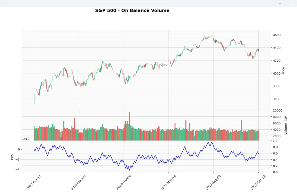
Despite these drawbacks, OBV can be a useful tool for intra-day traders when used in conjunction with other indicators and analysis methods. For instance, combining OBV with resistance/support analysis, trendlines, or other momentum indicators can improve its accuracy and help traders gain a more comprehensive view of the market. By doing so, traders can leverage OBV to make more informed trading decisions.
Fibonacci Retracement
Fibonacci Retracement is a popular technical analysis tool that uses horizontal lines to indicate areas of support or resistance at the key Fibonacci levels before the price continues in the original direction. These levels are created by drawing a trendline between two extreme points (a swing high and a swing low) and then dividing the vertical distance by the key Fibonacci ratios of 23.6%, 38.2%, 50%, 61.8%, and 100%.
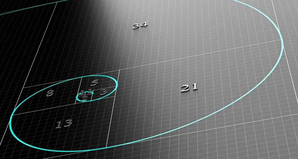
The tool is named after Leonardo of Pisa, an Italian mathematician also known as Fibonacci. He introduced the Hindu-Arabic numeral system to Europe and found a sequence in which each subsequent number is the sum of the two preceding ones, starting from 0 and 1. This sequence, known as the Fibonacci sequence, and the ratios between the numbers, have been applied to finance and used to predict areas of support or resistance in the markets.
The mathematical construction of the Fibonacci retracement involves two key steps:
- Identifying the highest point (peak) and the lowest point (trough) on the chart of the move you are interested in analysing.
- Drawing a vertical line through these two points and dividing it into sections based on the Fibonacci ratios (23.6%, 38.2%, 50%, 61.8%, and 100%).
Here’s a little joke for you: Why do some traders who are not a fan of Fibonacci retracement levels refer to them as ‘fibs’? Because they can be little lies! These levels might very well not work as expected. They’re just predictions, after all, and the market has a habit of telling its own story. Meanwhile if you draw enough fib lines on a chart some would appear to work eventually. I sat next to a trader in London who would put them on individual 5 minute candles, he went to work in television shortly after.
Traders look for signals to buy or sell when the price reaches these Fibonacci retracement levels. For example, if a stock is rising, a trader might look for it to pull back to a Fibonacci level before entering a long position, expecting the price to resume its upward trend from there. While this article is looking at intraday trades you can trade intraday of longer timeframe levels. For example have a look at the daily oil chart in this other article to see how it helped finesse an entry perfectly using Fibonacci.
Fibonacci retracements are popular among intra-day traders because they can provide potential entry and exit points. This is especially true in trending markets where the price often retraces before continuing in its primary direction. Traders might use these levels to set stop-loss orders or to time their entries and exits. A lot of automated trading systems incorporate them so they can be self fulfilling too.
While Fibonacci retracements can be a useful tool, they do have their limitations. The levels are subjective and depend on the specific points chosen by the trader. They are also based on the assumption that markets will follow patterns seen in nature, which often doesn’t always happen.
That said, when used in conjunction with other forms of technical analysis—such as trend analysis, volume, or momentum indicators—Fibonacci retracements (and extensions) can form part of a robust trading strategy, offering intra-day traders a deeper understanding of market trends and potential reversals. Besides if lots of other people are looking at them then you need to understand your opponents’ behaviours, so you should too.
Pivot Points
Pivot Points are a type of technical analysis indicator that help determine potential support and resistance levels in the market. They were initially used by floor traders in equity and commodity exchanges, who would calculate the pivot point for each trading day and use it as a reference point for making trading decisions.
Historically, Pivot Points have been a favored tool, especially among short-term traders. Their origin can be traced back to the days before computerized trading when floor traders needed quick and reliable tools to assist them in anticipating market movements.
The calculation of pivot points is straightforward and is based on the high, low, and closing prices of the previous trading day. The pivot point (P) is calculated as follows:
P = (High + Low + Close) / 3
Once the pivot point is calculated, it can be used to calculate the potential support and resistance levels. The first support and resistance levels (S1 and R1) are calculated as follows:
S1 = (P x 2) – High R1 = (P x 2) – Low
The second support and resistance levels (S2 and R2) can be calculated as follows:
S2 = P – (High – Low)
R2 = P + (High – Low)
To better understand these calculations, visualize a chart where the pivot point represents a central line or equilibrium. The support levels lie below this line, while resistance levels are plotted above it. Often, when the market opens above the pivot point, it’s seen as bullish for the day, and when it opens below, it’s perceived as bearish.
Signals to buy or sell are usually created when the price approaches these pivot points. If the price approaches the support level, it could be a buying signal as the price could bounce back up. If the price approaches the resistance level, it could be a selling signal as the price could start to fall.
One of the main advantages of pivot points is that they are simple. The calculation is straightforward, and the resulting levels can be easily plotted on a chart. This makes pivot points a very accessible tool for traders of all experience levels. Furthermore, because they are based on objective market data (previous day’s high, low, and close), they can provide a universal benchmark that all traders can agree upon.
However, a limitation of pivot points (like all technical analysis indicators) is that they are purely mathematical and do not take into account market sentiment or geopolitical events that can dramatically impact market prices. They also rely heavily on the concept of historical levels acting as future support and resistance, which is not always the case.
It’s worth noting that while pivot points are powerful on their own, they can be even more effective when combined with other indicators. For instance, pairing pivot points with oscillators like the RSI can provide additional confirmation for potential reversals at support or resistance levels.
For intra-day traders, pivot points can be particularly useful. These traders are looking for short-term price movements, and pivot points can provide clear, predefined levels of support and resistance that may influence price action and better their risk management. Traders can use these levels to help set stop losses or define target prices. Also, because pivot points are recalculated daily, they are always relevant to the current trading environment, making them an excellent tool for intra-day traders.
Key Takeaways
- Moving Averages (MAs): They smooth out price data to help identify the trend direction. The two main types are Simple Moving Averages (SMAs) and Exponential Moving Averages (EMAs). MAs can help identify trend direction and potential entry and exit points, but they may not be sufficient on their own and could lag behind real-time price changes.
- MACD (Moving Average Convergence Divergence): A trend-following momentum indicator that shows the relationship between two moving averages of a security’s price. It consists of the MACD line, signal line, and the histogram. The crossover of MACD and signal lines can suggest buy or sell signals.
- Bollinger Bands: A volatility indicator which consists of a SMA (middle band) with two standard deviation lines/bands above and below it. Bollinger Bands expand and contract based on market volatility. Prices are considered high when on the upper band and low when on the lower band.
- RSI (Relative Strength Index): A momentum oscillator that measures the speed and change of price movements on a scale of 0 to 100. It can help identify overbought (over 70) or oversold (below 30) conditions.
- DMI (Directional Movement Index): A momentum indicator that helps determine if a security is trending. It includes the ADX line that measures strength of the trend, and two DI lines that indicate the direction.
- VWAP (Volume Weighted Average Price): Gives an idea about the average price at which positions have been taken during the day. It can act as a potential support/resistance level and is often used by institutional investors to gauge market trend.
- Stochastic Oscillator: A momentum indicator that shows the location of the close relative to the high-low range over a set number of periods. It generates values between 0 and 100 and can help identify overbought and oversold conditions.
- OBV (On Balance Volume): Uses volume flow to predict changes in stock price. It can signal bullish or bearish moves before they happen, based on discrepancies between volume trends and price trends.
- Fibonacci Retracement: A tool that identifies potential levels of support and resistance using horizontal lines based on Fibonacci numbers being ratios found in nature.
- Pivot Points: Used to determine potential support and resistance levels based on the high, low, and close of the previous trading day. They provide clear levels that can help with setting stop losses and defining target prices.
Time frames for these indicators should also be considered in your day trading strategy, do the daily, hourly and 15 minute time frame signals created by the indicators you’re examining, concur or conflict with each other? If all three timeframes align you can have much more confidence in holding your position. Can you find a combination of indicators that confirm each other too? Now that you know how the ones above are constructed you should be able to select ones sufficiently different from each other to create useful combinations.
As a day trader, it’s important to remember that no single indicator can provide a sure-fire strategy for successful trading. Combining a few indicators, keeping an eye on the broader market sentiment, and always using a disciplined approach (like setting stop losses and taking profits at predetermined levels) can help you minimize losses and increase the chances of success in the volatile intra-day markets.
Have you tried any of these indicators, or do you prefer others? As the saying goes, ‘there’s a thousand ways to skin a cat’.



Leave a Reply